Plot IC Acceptance Matrix with Optional Rate-of-Improvement Overlay
Source:R/plot_ic_acceptance_matrix.R
plot_ic_acceptance_matrix.RdCreate a two-layer base R plot that visualizes information criterion (IC) scores across a sequence of sub-model evaluations, highlighting which steps were accepted vs rejected. Optionally, a secondary y-axis overlays the rate of improvement (first difference of IC scores) as a line with markers.
Usage
plot_ic_acceptance_matrix(
  matrix_data,
  plot_title = "IC Acceptance Matrix Scatter Plot",
  plot_rate_of_improvement = TRUE,
  rate_limits = c(-400, 150),
  baseline_ic = NULL
)
Arguments
- matrix_data
A two-column
matrixordata.frame. Column 1 must be numeric IC scores in evaluation order; Column 2 must be a logical or numeric flag (0/1) indicating whether the step was accepted.- plot_title
character(1). Title to draw above the plot.- plot_rate_of_improvement
logical(1). IfTRUE, overlay the first differences of the IC series on a secondary (right) y-axis along with a horizontal reference line at zero.- rate_limits
numeric(2). Y-axis limits for the rate-of-improvement overlay (i.e.,diff(IC)), used only whenplot_rate_of_improvement = TRUE. Defaults toc(-400, 150).- baseline_ic
Optional
numeric(1). If provided, this value is used as the baseline IC score (step 1) in place ofmatrix_data[1, 1]for plotting and for computingdiff(IC). Default isNULL(usematrix_data[1, 1]).
Details
The function expects a two-column object where:
Column 1 contains the IC score at each step (numeric; lower is better).
Column 2 contains an indicator for acceptance (0 = rejected, 1 = accepted).
The first IC value is treated as the baseline and is plotted as a larger
black point with a numeric label. If baseline_ic is supplied, it is used as
the baseline IC score (step 1) in place of matrix_data[1, 1] for both the
baseline annotation and the rate-of-improvement series (diff(IC)). This is
useful because matrix_data begins with the first evaluated shift model (rather
than the true no-shift baseline). To achieve this behavior, pass the true baseline via
baseline_ic to avoid labeling the first evaluated model as the baseline.
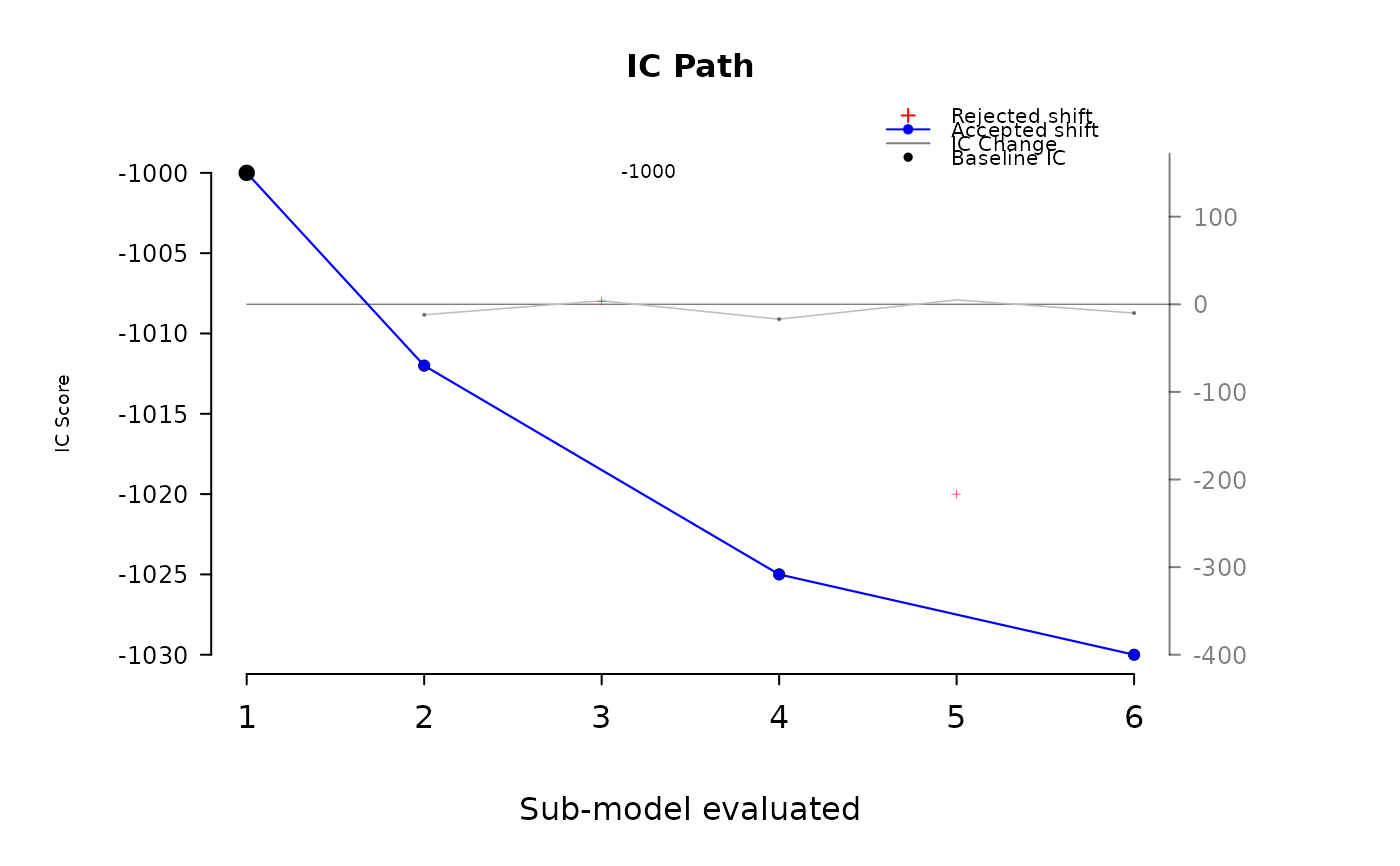
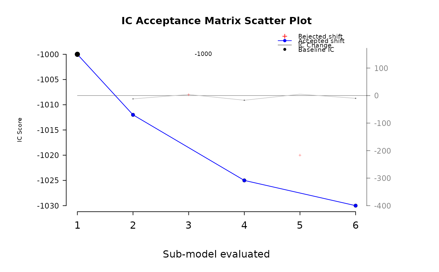
Accepted steps are drawn as blue filled points connected by a thin line; rejected
steps are drawn as small red crosses. When plot_rate_of_improvement = TRUE,
the function overlays a secondary y-axis on the right that shows diff(IC) values
(the per-step change in IC; more negative implies improvement).
The function uses only base graphics. It sets plot margins and mgp via
par(), and (when overlaying) uses par(new = TRUE) to layer the IC plot over the
rate-of-improvement axes. Initial user par is reset on exit.
Axes and scaling. Tick marks for the primary (IC) x/y axes are computed with
pretty() to give clean bounds. The secondary axis for the rate of improvement
uses rate_limits (default c(-400, 150)); adjust via the argument if your
expected diff(IC) range differs substantially.
Examples
ic <- c(-1000, -1012, -1008, -1025, -1020, -1030)
accepted <- c(1, 0, 1, 0, 1)  # steps 2..6 relative to baseline
mat <- cbind(ic, c(1, accepted))  # mark baseline as accepted for plotting
plot_ic_acceptance_matrix(mat, plot_title = "IC Path")

# Avoid non-ASCII glyphs in titles on CRAN/CI:
plot_ic_acceptance_matrix(mat, plot_rate_of_improvement = TRUE)

# Override baseline IC:
plot_ic_acceptance_matrix(mat, baseline_ic = -995)
